Featured Projects, Print & Design Inspiration
Branding for East Coast Cidery, Enfield, CT

Apr
East Coast Cidery is a new hard cider company located in Connecticut. It’s slated to be sold throughout the Northeastern United States, so keep a lookout for it and be sure to pick some up if you see it.
This was an exciting project, so it was only fitting that the process was documented throughout concept to completion.
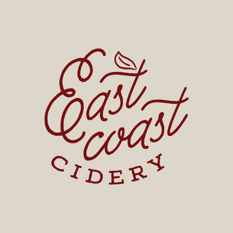
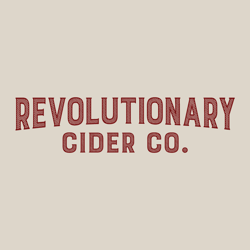
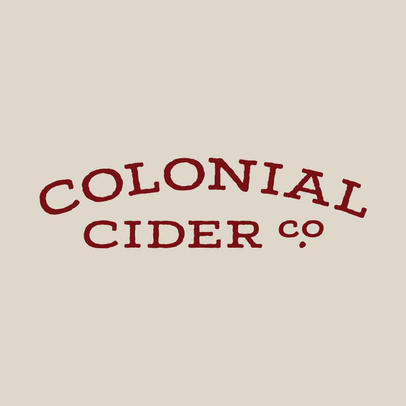
Initial concepts
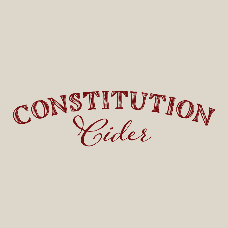
Before the name East Coast Cidery was solidified, several other concepts were presented:
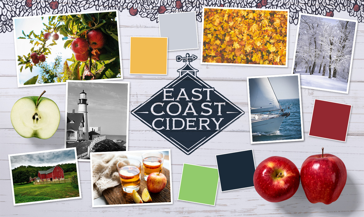
Mood Board
Mood boards are a collection of images, graphics, and colors used to convey a concept. They help get creative juices flowing and to develop the feeling of a brand. For this particular project, the goal was to create a brand that screamed “East Coast” with clean and modern fused with traditional design elements. Classic illustrations, four seasons, coastal living, crisp weather, and apples (of coarse) were all. The color pallet consists of bold, yet somewhat muted tones of red, gold, light blue, and green – all accented with the bold navy-grey blue primary color.
The Logo
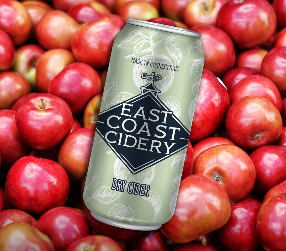
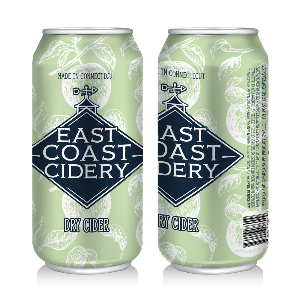
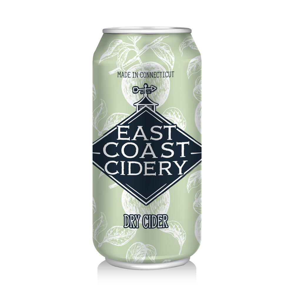
The East Coast Cidery logo is diamond shaped resembling the roof peak of a New England home. It has a rooftop cupola with a weather vane arrow pointing North. Look closely and you’ll notice a little apple perched on top of the weather vane. The goal was create an iconic logo that screamed “East Coast” and more specifically “New England”. It’s designed be versatile, attractive, memorable go well over a variety of backgrounds.
East Coast Cidery Primary Color:
- PMS 533
- RGB 31 42 68
- HEX/HTML 1F2A44
- CMYK 95721567
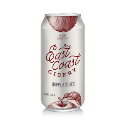
Packaging
Initial Concepts:
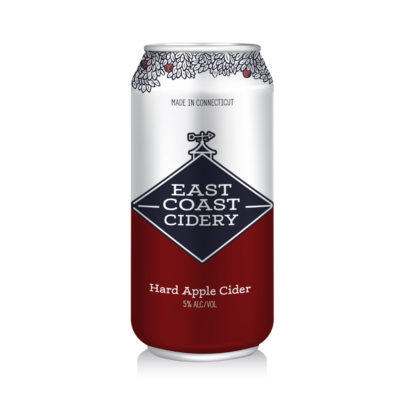
First Release: A Dry Cider